Imagine you have eight cups on a table, one tiny bell, and a friend with suspiciously good sleight of hand.
They hide the bell under one cup. You tap a cup. If it rings, you win.
That game is hard enough. Now make it stranger: instead of one cup, you have thousands. Each cup is a different strategy setting. One cup might be fast_length=12, slow_length=26, stop=2.0. Another might be fast_length=13, slow_length=28, stop=1.8. You test them all, sort by return, and the top row looks brilliant.
The top row may represent a useful setting, or a historical trick.
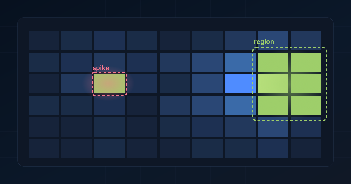
Atlas shows the terrain around the setting: whether strong results form a broad, forgiving region, or whether the winner is a lonely spike surrounded by weak neighbors.
Reading the result surface
A batch backtest turns a strategy into a surface.
The inputs are the coordinates: moving average lengths, thresholds, lookbacks, stop sizes, profit targets, time filters, and anything else the strategy can vary.
The outputs are the heights: return, drawdown, win rate, trade count, final equity, profit factor, or whatever metric we care about.
If the strategy has two inputs, you can imagine this as a landscape. One axis is the first input, one axis is the second input, and the height is performance. Good settings rise like hills. Bad settings sink into valleys.
Most real parameter sweeps are not two-dimensional. They are higher-dimensional response surfaces shaped by many knobs at once.
That is why a sorted table is useful but incomplete. A table can tell you which row won. It cannot tell you whether the winning row lives on a plateau, a ridge, or the tip of a needle.
When a peak is fragile
Suppose a sweep returns these three nearby settings:
| Fast length | Slow length | Return | Max drawdown | Trade count |
|---|---|---|---|---|
| 12 | 26 | 81% | 18% | 43 |
| 13 | 26 | 12% | 37% | 41 |
| 12 | 27 | -8% | 42% | 39 |
| 13 | 27 | 4% | 35% | 40 |
The first row is exciting, but the neighborhood is weak.
That pattern can happen for real reasons. Maybe the market had one sequence where a very specific timing rule caught a very specific move. Maybe the exit aligned with a single historical event. Maybe transaction costs, slippage, or the next month of data would knock it over.
The top row may be real, but the evidence is thin. If nearby settings collapse, then the strategy may be fragile. Tiny changes in the rule produce large changes in outcome.
Atlas looks for the opposite pattern:
| Fast length | Slow length | Return | Max drawdown | Trade count |
|---|---|---|---|---|
| 48 | 92 | 42% | 19% | 31 |
| 50 | 94 | 39% | 17% | 30 |
| 52 | 96 | 44% | 20% | 32 |
| 54 | 98 | 37% | 18% | 29 |
None of these rows may be the absolute winner. But as a group, they say something stronger: this area of the parameter space behaves similarly. If the exact input changes a little, the strategy does not immediately lose its footing.
This approach favors stable neighboring settings.
What Atlas means by a region
Atlas groups nearby parameter values into bins. A bin is a range. If a moving average length was tested from 10 to 100, Atlas might group those values into bands such as 10-20, 20-30, and so on.
Once the parameter space is binned, a region becomes a neighborhood: a combination of parameter ranges that contains many tested rows.
For each region, Atlas can summarize evidence:
- How many tested rows landed there.
- What share cleared the selected quality threshold.
- How strong the average or median result was.
- Whether the region has enough support to be trusted.
This is local aggregation. The interface summarizes neighborhoods, reducing thousands of points to local patterns.
A whole batch average can hide too much, while a single top row can reveal too little. A local neighborhood is specific enough to guide research and broad enough to resist one-off luck.
Setting the quality threshold
Atlas needs a definition of “useful” before it can score a region.
That definition might be simple:
- Return above 20%.
- Max drawdown below 25%.
- At least 30 trades.
Or it might be stricter:
- Return above buy and hold.
- Drawdown below buy and hold.
- Win rate above 45%.
- Enough trades to avoid a one-trade miracle.
The exact threshold depends on the research question. A trend-following strategy may have a lower win rate but need a strong profit factor. A mean-reversion strategy may need many trades and controlled drawdown. A strategy tested on a low-volatility market may need different return expectations from one tested on crypto.
Atlas leaves that judgment to the researcher. Under a chosen definition of useful, it shows which neighborhoods remain alive.
Sensitivity screening: choosing the dimensions that matter
There is one more problem. If a batch has ten parameters, not all ten deserve equal attention.
Some inputs may barely move the result. Others may control everything. Atlas uses sensitivity screening to prioritize dimensions that meaningfully change the score.
Sensitivity screening shows which knobs seem to matter.
If changing a threshold from 0.5 to 0.6 barely affects performance, that input may not be worth a region map right now. If changing a trend filter length from 100 to 250 transforms the results, that dimension deserves attention.
An inspectable region view should reduce a large sweep to a handful of places worth opening and avoid burying the user in a cube of impossible geometry.
Reading an Atlas result
A winning row might read, “The best setting was 12, 26, 9.” Atlas adds the surrounding region:
“The strategy performs best when the fast length is in the 48-56 range, the slow length is in the 90-104 range, and the stop is not too tight. The region has strong support, most rows clear the threshold, and the nearby settings have similar trade counts.”
The second statement is messier and more useful.
It gives a trader something to inspect. They can open representative rows, compare trade histories, test neighboring markets, and decide whether the region survives out-of-sample checks.
What Atlas can and cannot show
Atlas cannot turn weak strategy logic into an edge or establish profitability. Its job is to show where the parameter search has structure.
If a sweep is mostly noise, Atlas should make that easier to see. If a strategy has a broad plateau, Atlas should bring that region forward. If a top result is brilliant but isolated, Atlas should make the isolation obvious.